My Tasks in Apollo: more filtering options
Hello friends,
When you create a program, you expect some parts of it to be very popular and wildly used by your users. Then you release it, and... discover that some sections were just not as important as you thought they would be, while some others become absolutely critical.
My Tasks in Apollo is one of those sections: in the initial drawings, it was meant to be just a list of personal tasks. As design went on, it was obvious that it was more important than originally thought as it should obviously display personal and company tasks as well. When Apollo went live, My Tasks proved to be "the" spot where a lot of our users literally lived!
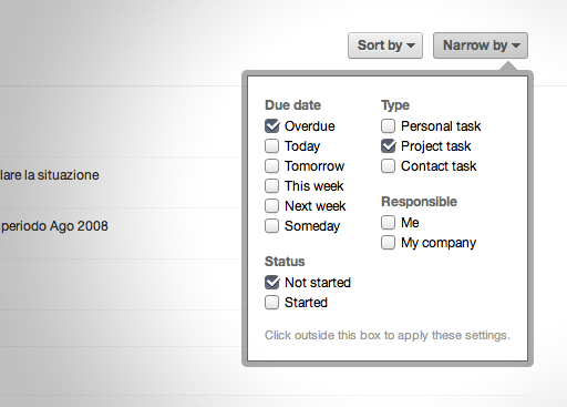
So, to make the long story short: we have recently improved My Tasks quite dramatically. You can now slice and dice tasks in a more flexible way, or filter out the noise and only concentrate on what matters.

Keep in mind that unless you select a filtering option, no filter will be applied for that category. So, for example if you don't select neither "Not started" nor "Started" in the "status" filter, Apollo will show tasks regardless of their status. However, if you tick "Started", then only started tasks will appear.
The old layout, where things were grouped by Personal tasks, Project tasks and Contact tasks, is now gone (as you can filter for whatever you like).
As usual, please let us know what you think. We will keep on improving it as time goes by, based on your comments and ideas!

4 comments so far
Brian Greenwood
Wed, 09/28/2011 - 04:51
This is definitely an improvement - thank you! You have the sort by date and title, would be nice to "group by" as well: (group by: none, task owner, project)
Thanks again! - So how about the ability to select what things send out notifications instead of all or nothing? ;)
Tony Mobily
Wed, 09/28/2011 - 17:28
Hi Brian,
This is only a "new beginning" for My Tasks. We will add features as time goes by.
I am not sure I understand 100% what you are saying in terms of notifications -- please email us, we'll reply promptly as ever!
Merc.
Hans-H. Franck
Thu, 09/29/2011 - 01:45
It´s great that there are more options in this section now.
But why have you eliminated the sidebar?
First, half of my screen (1280px resolution) is empty now cause the lenght of the tasks are usually not more than five words.
Second, because of the missing sidebar this page is not consistent anymore compared to e.g. the task lists in "Projects". So if you switch between these pages the whole experience feels a little bit unsettled. (The same UI inconsistency you have created in the otherwise very useful new feature "search notes").
And third, in the previous version you needed just one click to filter the tasks, now you need three clicks (clicking on button, clicking checkbox and clicking outside the box)!
So why don't you integrate the whole content of the "narrow by"-box into the sidebar?
If for some users too many informations are permanently visible then, they might toggle this section open/closed like the "keep people notified" sliding function in the comments.
Tony Mobily
Thu, 09/29/2011 - 22:24
Hi,
Thank you so much for your thoughtful and detailed reply! We are improving Apollo all the time, and this is great feedback for us.
I am passing this on to the designers!
Thanks,
Merc.