More improvements: collapsed notify section, expanding comment form, new export permission
Hi there,
Software development happens in small steps. Before our deserved summer break (which is just about to end!), we released several small improvements in Apollo. We covered a some of them last week. Here is the rest:
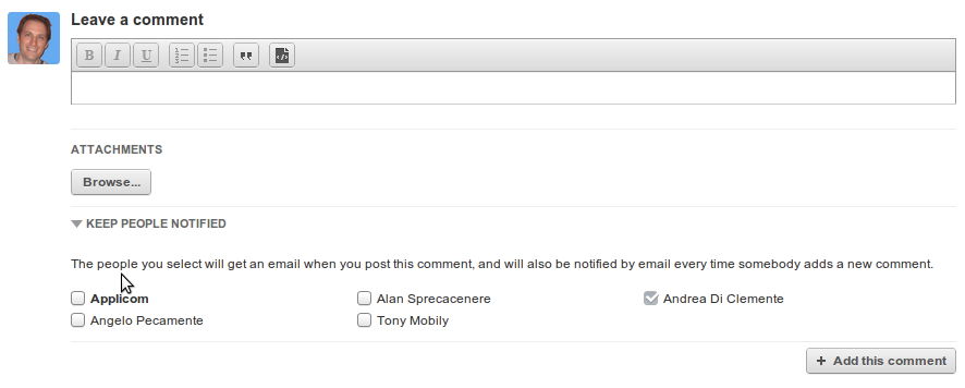
The "notify" section is now collapsed by default
We gave this some thought, and decided that the main means of "subscribing" to a task should be by dropping a comment. This is what happens naturally in several blogs. It's obviously possible to unsubscribe from a task by clicking on the column on the right hand side. We have been discussing the future of the "notification" area: please let us know your thought with comments, email and twitter!


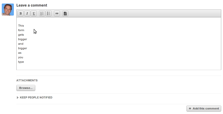
The comment form is tiny -- but it expands!
When we rolled this out, many users thought there was a problem: the Rich Text comment form had suddenly become very small! The good news is that it was done on purpose: when you type a message, it will auto-expand and adjust to the right height, so that typing and re-reading your messages is comfortable. We are discussing the possibility to change it so that it extends vertically more quickly, ala Gmail -- let us know what you think!


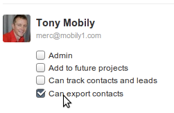
New permission: "can export contacts" for internal users
We decided to improve the permission system so that any internal user could be given the right to export contacts. Many of you already know that we aim at keeping Apollo's permission model very simple. This change however will give selected internal users a way to easily use the company's contact list for mailouts, or import, etc. (And yes, keep in mind that you can select a range of contacts to export! )

Hopefully, you will be able to make use of some of these improvements!

2 comments so far
Brian Greenwood
Thu, 09/01/2011 - 08:26
These are all great, except as old users of basecamp, we are used to seeing the notify list by default. We have posted several messages now and my people just assumed it was notifying the people on the project. It would be great to be able to toggle this default in our preferences.
Also, this method of selecting people to notify is much preferred to the method used in messages where you have to switch to another tab. It's not intuitive and we have had to delete and resend messages several times because either it didn't go to the intended recipient, or because we forgot to attach the file before switching to the second tab. The options tab is a great feature, but should be for the less used options, not the meat of the function.
I am not sure if this is a bug or not - so may not belong here, but since I am in a diatribe - when we post a private message, replies by email to it are made public - one would assume that replies to a private message would also remain private.
Tony Mobily
Fri, 09/02/2011 - 06:02
Hi Brian,
In Basecamp, they recently took out the subscription checkboxes from comments, although they still have them for project messages.
We realise that putting those notification checkboxes in a different screen is very much sub-optimal, and will be changing it soon (towards the end of September).
About replies being public: yes, this is something we need to address -- we will this coming Monday, and will keep you informed!
Thanks a lot Brian,
Merc.