What's new in your Apollo this summer: comment form at top, translation extras, HTML in project description, clear formatting
Hi there,
Apollo's development is very much user-driven. This implies that quite a few users will find here features they requested a little while ago. Here are some of the features that recently made it into Apollo?
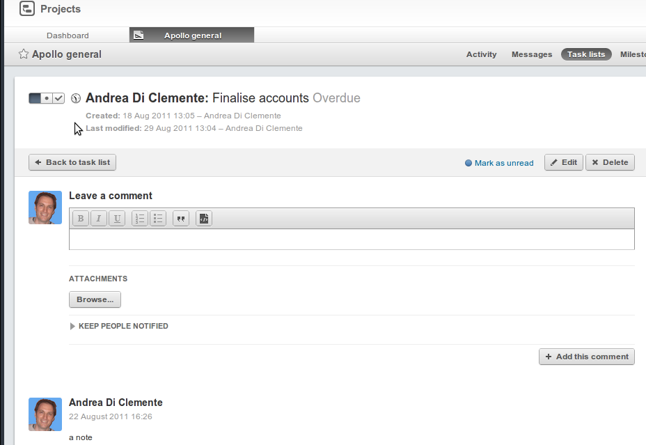
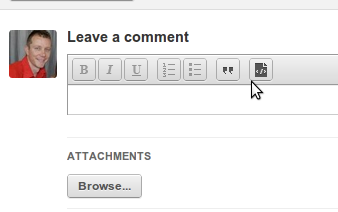
Comment box at the top when comments are shown in reverse order
We were asked to show task comments in reverse chronological order: it was important to show fresher comments closer to the top of the page (and to the task description itself). We then realised that when showing comments this way, it made a lot more sense having the comment form at the top. So, we did it:
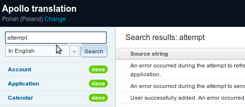
Translators can search for strings, and use UTF8 instead of HTML entities
We really wanted to create a translator's Nirvana when we created the application for translators. The response to it was incredible: Apollo became multi-lingual in a matter of days. However, as it turned out, our application wasn't quite Nirvana just yet: users couldn't search for specific words in the translations, and had to use HTML entities (things like è) instead of accented letters. This made things confusing for some users. So... we hopefully got a little closer to Nirvana with a nice search box, and full support for "native" (see: keyboard-generated) accented letters.
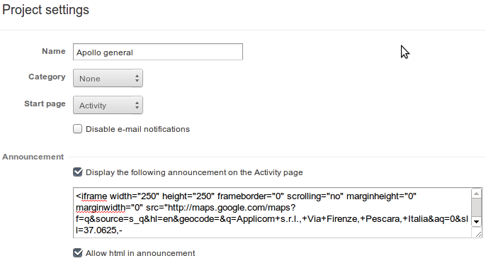
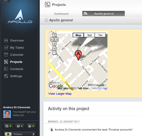
Allow HTML snippet in the project description
When we designed Apollo, we had a field for "project description". It made sense: it was only natural that users would want to explain what a project was about, after creating it. We were then requested, several times, to allow us to 1) Have HTML in the description 2) Show the description in the project's Activity page. We did... and are now seeing several users adding things like Dropbox snippets in their project description, and using it as an effective way to drop files in their projects. Or, adding a Google Maps link with the location of the building site they are working on. This says something about the power of the Internet!
The option to "Clear formatting" in the Rich Text editor
The Rich Text editor was a blessing for many: you could finally add basic, but important, formatting options to your messages and comments. We worked really hard so that emails, which we still send text-only, were still well-formatted and clear, converting the Rich Text into text. However, when people pasted their HTML into the Rich Text editor, we hit some hard-to-predict issues: each browser pasted things in its own special way, trying its very best to confuse our naive editor. In order to simplify matters, we added a button that clears all formatting from your message. So, now you can: 1) Copy contents onto your clipboard 2) Paste it into the Rich Text editor 3) Clear the HTML formatting that came with the browser. This should make the Rich Text editor a better tool.
There is obviously more to come -- I will see you here next week!
